Plot
Heatmap
A heatmap can be used to show relative abundances oftaxa in samples or groups of samples. The plot.heatmap function can be used like this.
[1]:
import qdiv
obj = qdiv.MicrobiomeData.load_example("Saheb-Alam_DADA2") #First we load example data
obj.rename_features(inplace=True, name_type="ASV") #This is the name the features ASV1, ASV2
obj.tax_prefix(add=True, inplace=True) #This is to add prefix to the taxonomic classified, i.e., d__ for domain, p__ for phylum, etc.
print(obj.meta) #Let's have a look at the meta data before plotting the heatmap
       location     feed mfc
sample
S4        anode  acetate   B
S5        anode  acetate   B
S6        anode  acetate   B
S7        anode  acetate   B
S10     cathode  acetate   B
S11     cathode  acetate   B
S12     cathode  acetate   B
S13     cathode  acetate   B
S20       anode  glucose   D
S21       anode  glucose   D
S22       anode  glucose   D
S23       anode  glucose   D
S26     cathode  glucose   D
S27     cathode  glucose   D
S28     cathode  glucose   D
S29     cathode  glucose   D
[2]:
fig, ax, data = qdiv.plot.heatmap(obj, group_by=["feed", "location"], levels=["Phylum", "Genus"])
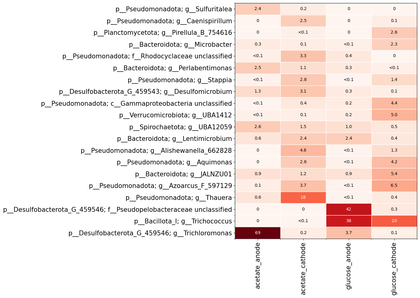
Here I chose to group the samples based on the meta data columns ‘feed’ and ‘location’. I also specified that I want to show phylum and genus levels on the y-axis. The features are grouped based on the lowest taxonomic level chosen (i.e. genus in this case).
Alpha diversity profiles
The plot.alpha_diversity_profile function let’s us visualize how alpha diversity depends on diversity order.
[3]:
import qdiv
obj = qdiv.MicrobiomeData.load_example("Saheb-Alam_DADA2")
obj.rename_features(inplace=True, name_type="ASV") #This is the name the features ASV1, ASV2
obj.tax_prefix(add=True, inplace=True) #This is to add prefix to the taxonomic classified, i.e., d__ for domain, p__ for phylum, etc.
obj.rarefy(inplace=True) #Rarefy to make comparison of alpha diversity between samples easier
fig, ax, data = qdiv.plot.alpha_diversity_profile(obj, color_by="location")
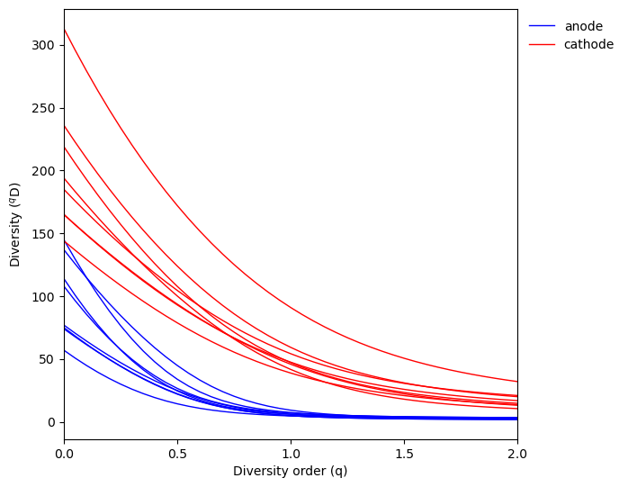
Here we can see the cathode samples tend to have higher diversity than anode samples for all diversity orders.
Beta diversity
Similarities and differences in community composition between samples if often visualized using an ordination. First, we calculate pairwise dissimilarities between samples using the diversity.naive_beta function.
[4]:
import qdiv
obj = qdiv.MicrobiomeData.load_example("Saheb-Alam_DADA2")
obj.rename_features(inplace=True, name_type="ASV") #This is the name the features ASV1, ASV2
obj.tax_prefix(add=True, inplace=True) #This is to add prefix to the taxonomic classified, i.e., d__ for domain, p__ for phylum, etc.
obj.rarefy(inplace=True)

dis = qdiv.diversity.naive_beta(obj, q=1) #Here I calculate for q=1
Next, we plot a principal coordinate analysis using the plot.ordination function.
[5]:
fig, ax, res = qdiv.plot.ordination(dis, obj, color_by="location", shape_by="feed")
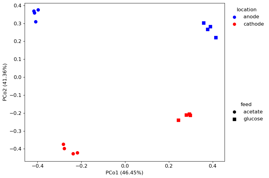
The res output is a dictionary that includes information about the ordination results.
res[“meta”] contains the metadata with the coordinates for the points added as columns: “PCo1” and “PCo2”.
res[“pct_explained”] contains information about the percent variation explained by each axis.
[7]:
print(res["meta"])
print(res["pct_explained"])
    location     feed mfc      PCo1      PCo2
S4     anode  acetate   B -0.422924 -0.366974
S5     anode  acetate   B -0.414454 -0.308858
S6     anode  acetate   B -0.419395 -0.356684
S7     anode  acetate   B -0.404560 -0.370697
S10  cathode  acetate   B -0.231987  0.431153
S11  cathode  acetate   B -0.270401  0.400800
S12  cathode  acetate   B -0.212815  0.419261
S13  cathode  acetate   B -0.272921  0.380127
S20    anode  glucose   D  0.414208 -0.223915
S21    anode  glucose   D  0.381922 -0.262631
S22    anode  glucose   D  0.391101 -0.284268
S23    anode  glucose   D  0.358608 -0.309530
S26  cathode  glucose   D  0.277438  0.207323
S27  cathode  glucose   D  0.295947  0.208371
S28  cathode  glucose   D  0.294605  0.199813
S29  cathode  glucose   D  0.235628  0.236709
PCo1    46.34
PCo2    41.23
PCo3    10.28
PCo4     1.32
PCo5     0.42
PCo6     0.22
PCo7     0.09
PCo8     0.08
PCo9     0.03
dtype: float64
[ ]: